My Photoshopping skills are somewhat limited, but sometimes I do something that turns out good, or better than that. I’ve been messing around with graphics programs for years and have learned a thing or two, and some tricks, and gained a lot of experience and a little ability. Luckily, I enjoy playing with graphics programs and find it relaxing to do so in a Zen kind of way, plus the creativity involved in creating something out of nothing. (including modifying something existing)
And I do have many years of design experience, from newspaper work, print shop work, website work, etc., and my own voluminous projects, which always comes in handy. So I at least have some experience and ability and talent in the general areas involved in such things.
Such is the case, imo, with the cover of Katydid. (if I do say so myself)
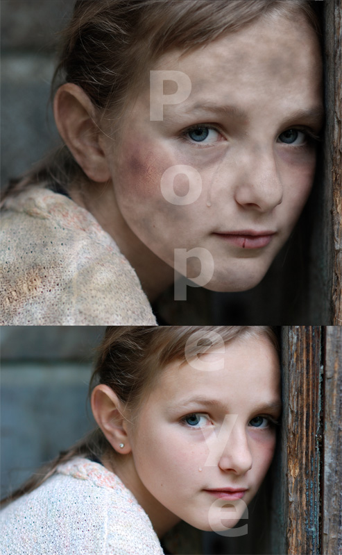
As you can see by the image below, I changed a stock photo ($50 for 5) of a cute, model-looking, young girl into a bruised, battered, and dirty post-apocalyptic ‘street’ urchin. (I used one of the 5 stock photos as the rear cover, too — a forest scene with a river running through it, which harkens to a part of the story)
I like the cover image, anyway, and think it is more than good enough. I’m actually a little proud of it. And a little surprised (and thankful) it turned out as well as it did. I couldn’t afford to pay for something like this, so I was left to my own devices.
I don’t use full Adobe Photoshop, I use Photoshop Elements, the cheaper, less-functional version of the software. I’m behind on the upgrades and am still using version 10. I think they are up to 12 or 13 now. I get the double-pack of Adobe Photoshop Elements with Adobe Premiere Elements (film editing). The cost is about $100. It’s a nice little program that does what I need 99% of the time.
This is basically what I did to create the transformation: (without making this a Ps tutorial)
1) Removed the diamond earring stud from her ear.
2) Dirtied her face and sweater with an overall image “dirt” that was smudged here and there to make it look more realistic, in part following the curves of her face. (this also took some of the shine off of her hair, kind of making it look dirty, too, as well as making her eyes less shiny)
3) Found an image of a torn sweater that is similar in weave on the Internet, cut the tear out, and used it to make her sweater look frayed and torn. (blending and such) Unfortunately, most of this was lost in the cropping, but it still shows in the bottom-left. Also stained it a little.
4) Found an image of a bruise/wound on the Internet, cut it out, and added it to her upper cheek. (blended it in)
5) Found an image of a split lip on the Internet, cut it out, and added it to her lip.
6) Darkened under her eyes.
7) Darkened her lips and maybe made them a little down-turned at the corners.
8) Made the existing tear “dirty” and made the tear streak ‘muddy’.
9) Darkened and desaturated the image overall.
The end result being a pretty decent cover image. And then I added the title and author name text. (somewhat minimalist design) Not a huge amount of work, but not a small amount either. It took me several hours or so. A successful result at the very least.
I think I achieved an image of a young-ish girl who is kind of sad and lonely, and has obviously seen a hard time of it, but is also possibly strong and determined and resilient and a survivor. See elsewhere on the site for the final cover image.
